The Project and the Challenge of the Range
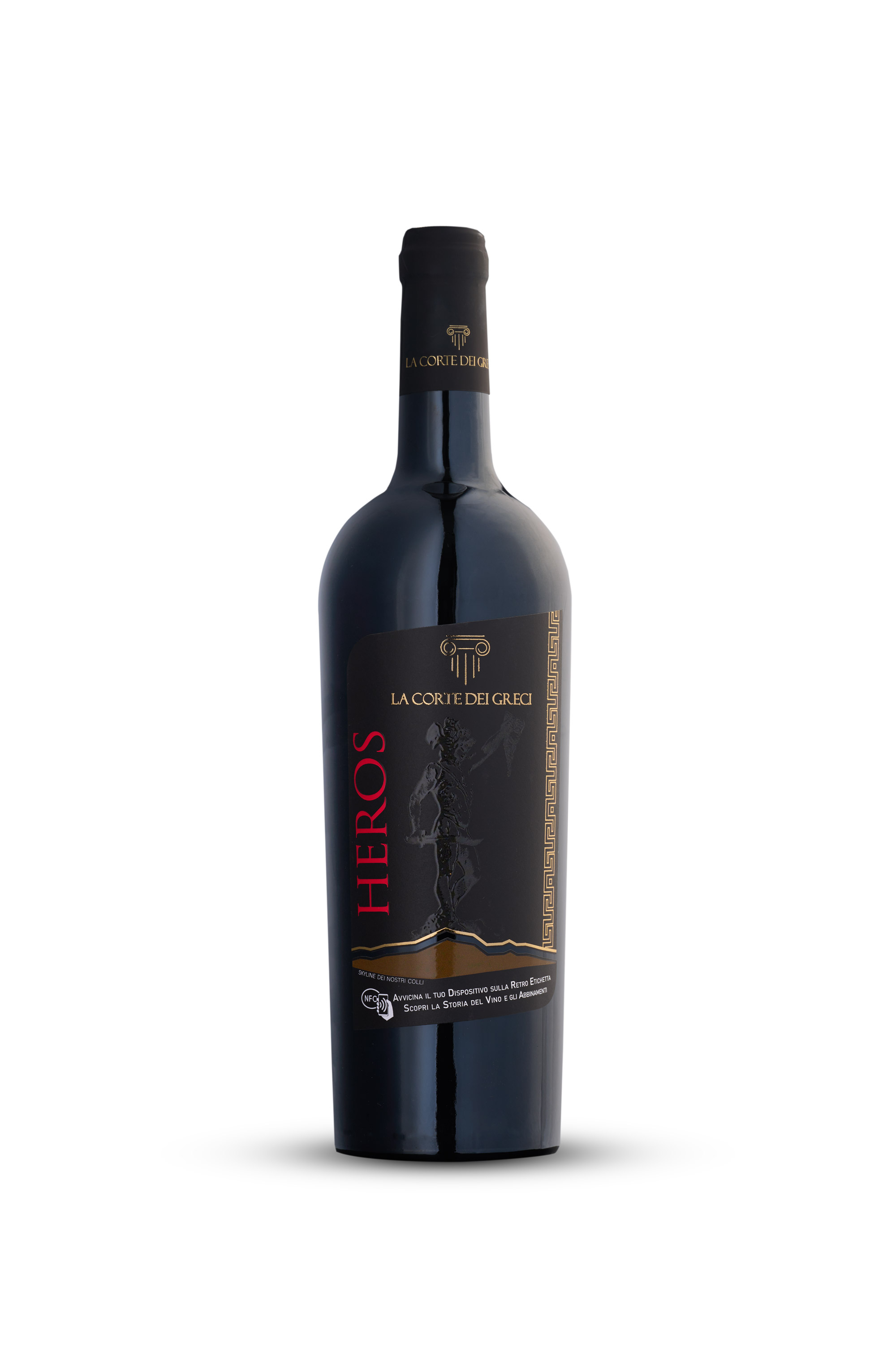
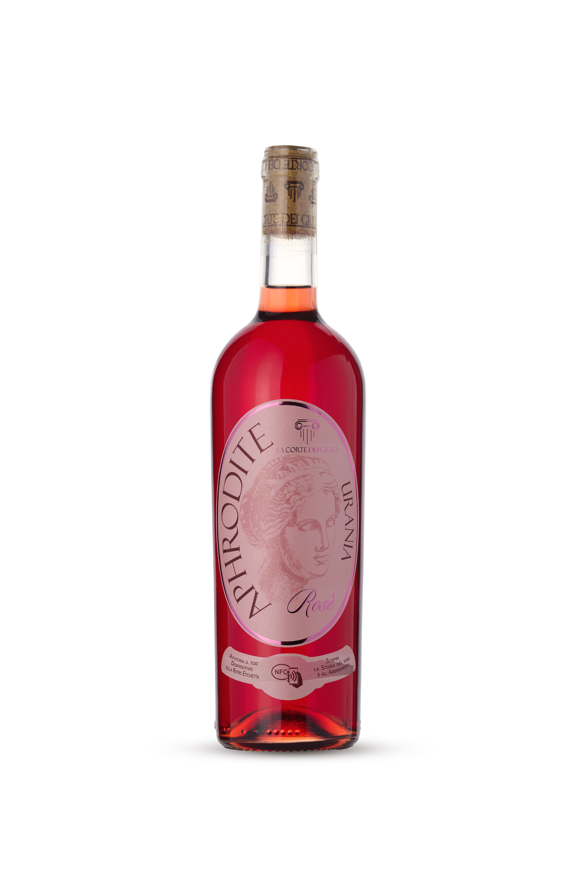
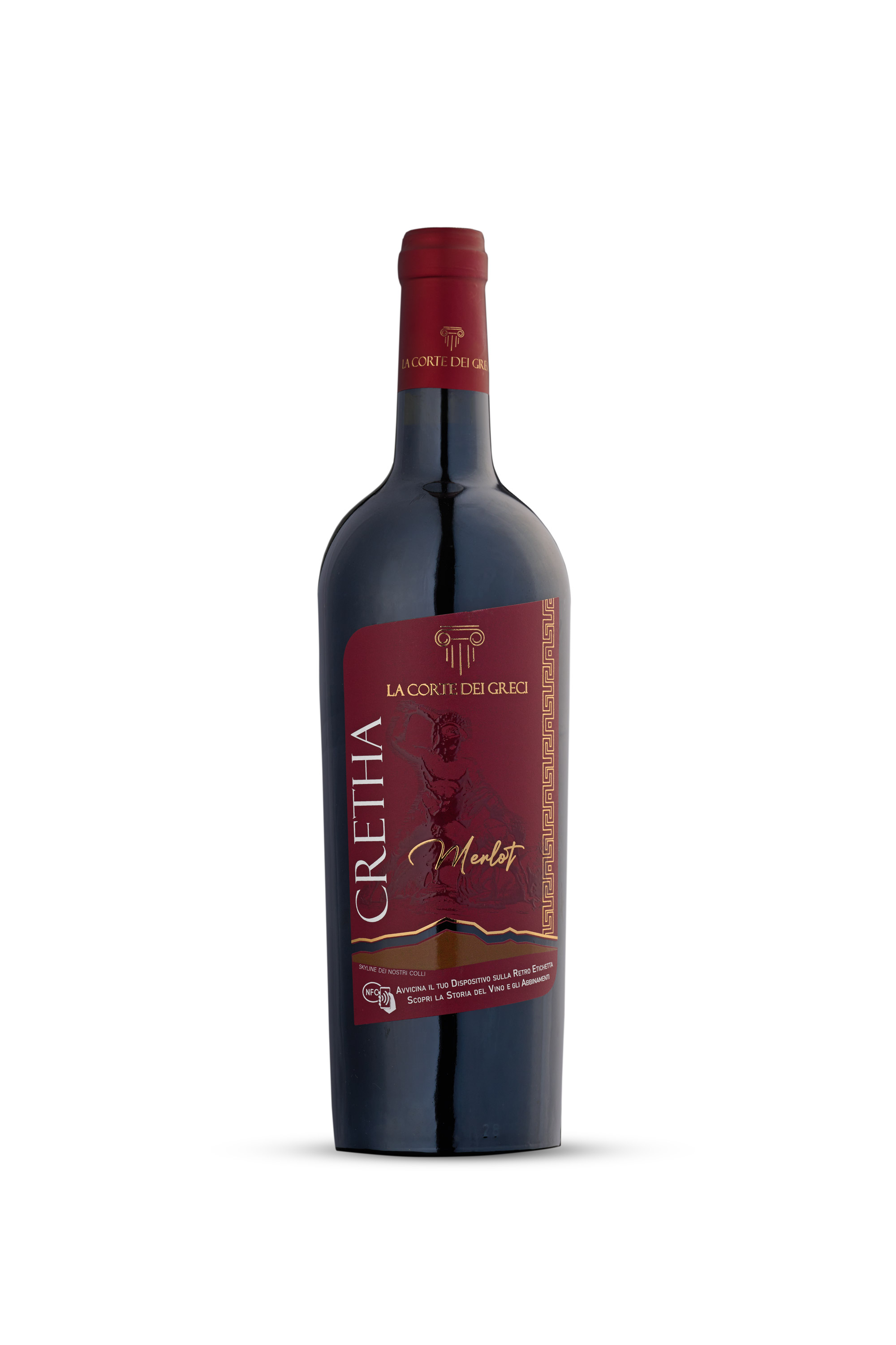
When a winery decides to renew its image completely, from labels to packaging, photography has the crucial task of translating that change into a strong, consistent visual language. For La Corte dei Greci the request was twofold: to showcase the new bottles with top-quality images for catalogues and communication materials, and to ensure complete visual continuity across very different products.
The real technical complexity in productions like this lies not only in managing reflections, but in handling opposite materials, such as dark glass and clear glass, while keeping exactly the same lighting set-up, a uniform background and, crucially for editorial layout, perfectly consistent proportions and positioning within the frame.
The restyling went beyond appearance: the producer chose to build an NFC chip into the new label, allowing consumers to discover the best food and wine pairings simply by holding their smartphone close to the bottle. This is not just a graphic refresh but a genuine technological step forward in how the brand talks to its audience. The initiative came entirely from La Corte dei Greci's own vision; the photography supported it with a visual language that brings the same care and elegance to every shot in the range.
1. Light, Refraction and Shadow Control
Photographing wine bottles demands strict control of the light gradients along the sides of the glass, to avoid unwanted reflections and give the body of the bottle a sense of depth:
- Dark Glass: Handled by emphasising the profiles with carefully calibrated side strip boxes, which define the contours without flattening the front label.
- Clear Glass: Requires complex specular lighting schemes and controlled backlit backgrounds to avoid a "flat" look and bring out the purity of the liquid and the transparency of the glass.
- Ground Shadows: To give a real sense of volume and grounding without compromising the clean frame, shadows were calibrated according to the density of the glass: deeper and more defined on the dark bottles to stress their solidity, softer and more diffused on the light, clear ones.
2. Alignment and Editorial Flow
One often underestimated aspect of still life photography for catalogues and price lists is geometric consistency between shots. When a designer or a client leafs through the catalogue, the products need to follow one another in a seamless visual sequence.
Precision in the Frame
Using fixed reference points on set and a locked camera position, every bottle, regardless of shape, glass colour or thickness, was placed at exactly the same point in the frame. This eliminates small jumps at the layout stage and gives an immediate sense of order and refined luxury.
The Beauty of the Product at the Centre
Beyond technical rigour, the aim of every shot was to put the beauty of the bottles themselves at the centre: a catalogue that not only documents the product accurately but fully conveys the elegance of its shapes, the quality of its finishes and the refinement of its packaging, so that anyone browsing the images perceives the same value the consumer holds in their hands.
The Value for Corporate Communication
The end result is a solid, flexible image library ready for every communication channel: from printed corporate catalogues to technical sheets for distributors, through to the company's digital and social channels. A project in which the studio's technical precision becomes the ideal tool for raising the brand's profile in the market.
An image library planned this way becomes a truly versatile tool: the same images can be reused consistently across catalogues, technical sheets, e-commerce and social media, ensuring a recognisable visual identity wherever the brand appears. Studio images can also be placed, using generative AI, into richer settings and contexts, expanding communication options without new shoots for every new use.